Line Charts
Line Graph is the innovative version of Bar Graph representation. If we connect the upper point of the first Bar to the upper point of the second Bar and then tie these dots, we will get a line. Repeating the procedure gives us the Line Graph representation. Line graph and bar graph are easy to comprehend.
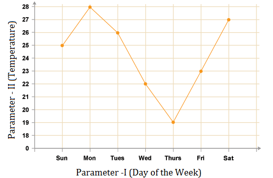
A Line Graph looks like this:
Important Points:
While solving the line chart questions, some points are very crucial to note these are as follows:
1. Understanding the various headings of DI table/graph/chart is very important.
2. Data Interpretation depends upon the type of questions asked.
3. Some questions are solved via reasoning process.
4. And solving some questions helps solving the other questions.
This section comprises of questions in which the data collected in a particular discipline are represented by specific points joined together by straight lines.
The points are plotted on a two-dimensional plane taking one parameter on the horizontal axis and the other on the vertical axis.
The candidate is required to analyse the given information and thereafter answer the given questions on the basis of the analysis of data.
TIPS on answering Aptitude Questions on Data Interpretation
Tip #1: Use a physical calculator and a notepad
Online proctored tests disallow candidates from using Calculator Software Applications in Desktop/ Laptop/ Mobile Device where the test is being given. However, a separate handheld calculator can be used.
Use a notebook with a pencil to jot down relevant numbers to help you in making quick calculations.
Tip #2: While calculating averages, it is easier to assume an approximate mean and calculation average of differences from that mean
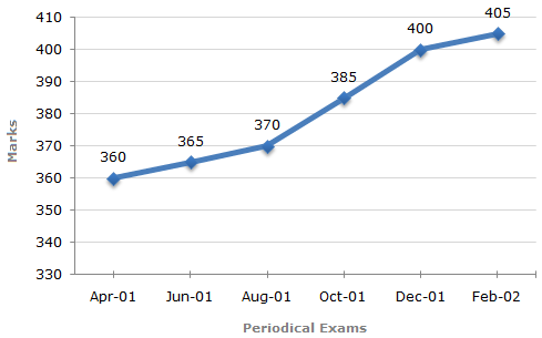
Question: What is the average marks scored by the student across all six periodical exams?
Solution:
You can assume the mean to be 380.
The differences from the assumed mean are: -20, -15, -10, +5, +20, +25
Average of the differences = + 0.83333
Average Marks = Assumed Mean + Average Difference = 380.8333
Maximum Total Marks in each Periodical Exam = 500
Tip #3: Percentage of Change (Increase/ Decrease) = Difference/ Original Value * 100
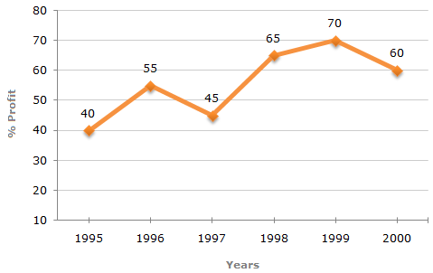
Question:
If the expenditure in 2000 is 25% more than expenditure in 1997, then the income in 1997 is what percent less than the income in 2000?
Solution:
Assume that Expenditure in 1997 is ₹ 100. Expenditure in 2000 = ₹ 125.
Profits in 1997 = ₹ 45 (45% of expenditure)
Income in 1997 = ₹ 145
Profits in 2000 = ₹ 75 (60% of expenditure)
Income in 2000 = ₹200
Change in income from 2000 to 1997 = Change/ Original Value x 100 = 55/200 * 100 = 27.5%
Percent Profit Earned by a Company Over the Years.
| %Profit = | Income - Expenditure | x 100 |
| Expenditure |
LearnFrenzy provides you lots of fully solved "Line Charts" Questions and Answers with explanation.