Notifications are an essential part of any user interface. They keep users informed, help in decision-making, and provide feedback. In Salesforce, Lightning Web Components (LWC) offer a variety of ways to display notifications to users.
In this blog, we'll explore different types of notifications available in LWC and how to implement them effectively.
Notifications in LWC serve multiple purposes, such as alerting users about important information, requesting their confirmation for critical actions, collecting user input or feedback, and discreetly providing information through toast notifications. Let's dive into each of these notification types and learn how to use them effectively in your LWC components.
A component can send a notification that pops up to alert users, request confirmation from them, prompt a response, or simply provide information.
In LWC, we have 4 ways to display notification
- Alert Modal
- Confirm Modal
- Prompt Modal
- Toast Notification
1. Alert Modal
The Alert Modal is a straightforward way to quickly alert users about important information, errors, or critical updates. It is designed to grab the user's attention with a prominent and eye-catching message.
- To display an alert modal in Lightning Experience, import `LightningAlert` from the `lightning/alert` module, and call `LightningAlert.open()` with your desired attributes.
- `LightningAlert.open()` is always return Promise, to handle promise use
async/awaitor.then()for any code you want to execute after the modal is closed.
Example Code:
  <lightning-button label="Show Alert" title="Show Alert" onclick={showAlert}>
  </lightning-button>
// alertModalExample.js
import { LightningElement } from 'lwc';
import LightningAlert from "lightning/alert";

export default class AlertModalExample extends LightningElement {
  async showAlert() {
    await LightningAlert.open({
      message: "This is the alert message.",
      theme: "error",
      label: "Error!",
    });
  }
}
Let's break down the code:
- `import { LightningElement } from 'lwc';`: This line imports the necessary module for Lightning Web Components and defines the base class for the component.
- `import LightningAlert from "lightning/alert";`: Here, the code imports the `LightningAlert` module from the "lightning/alert" library. This module is used to create and display alert modals.
- `export default class AlertModalExample extends LightningElement {`: This line defines the LWC class named `AlertModalExample, which extends the `LightningElement` base class.
- `async showAlert() { ... }`: Inside the class, there's a method named `showAlert()`. This method is marked as `async`, indicating that it can handle asynchronous operations.
- `await LightningAlert.open({ ... });`: Within the `showAlert()` method, an alert modal is created and opened using the `LightningAlert.open()` method. This method takes an object with various properties:
- `message`: The text message to be displayed in the alert.
- `theme`: The theme or style of the alert (in this case, "error" for an error message).
- `label`: The label or title for the alert (in this case, "Error!").
In summary, this code defines an LWC that, when used, can trigger the display of an alert modal with a specified message, theme, and label. The `showAlert()` method is the entry point for showing the alert modal.
Output:
2. Confirm Modal
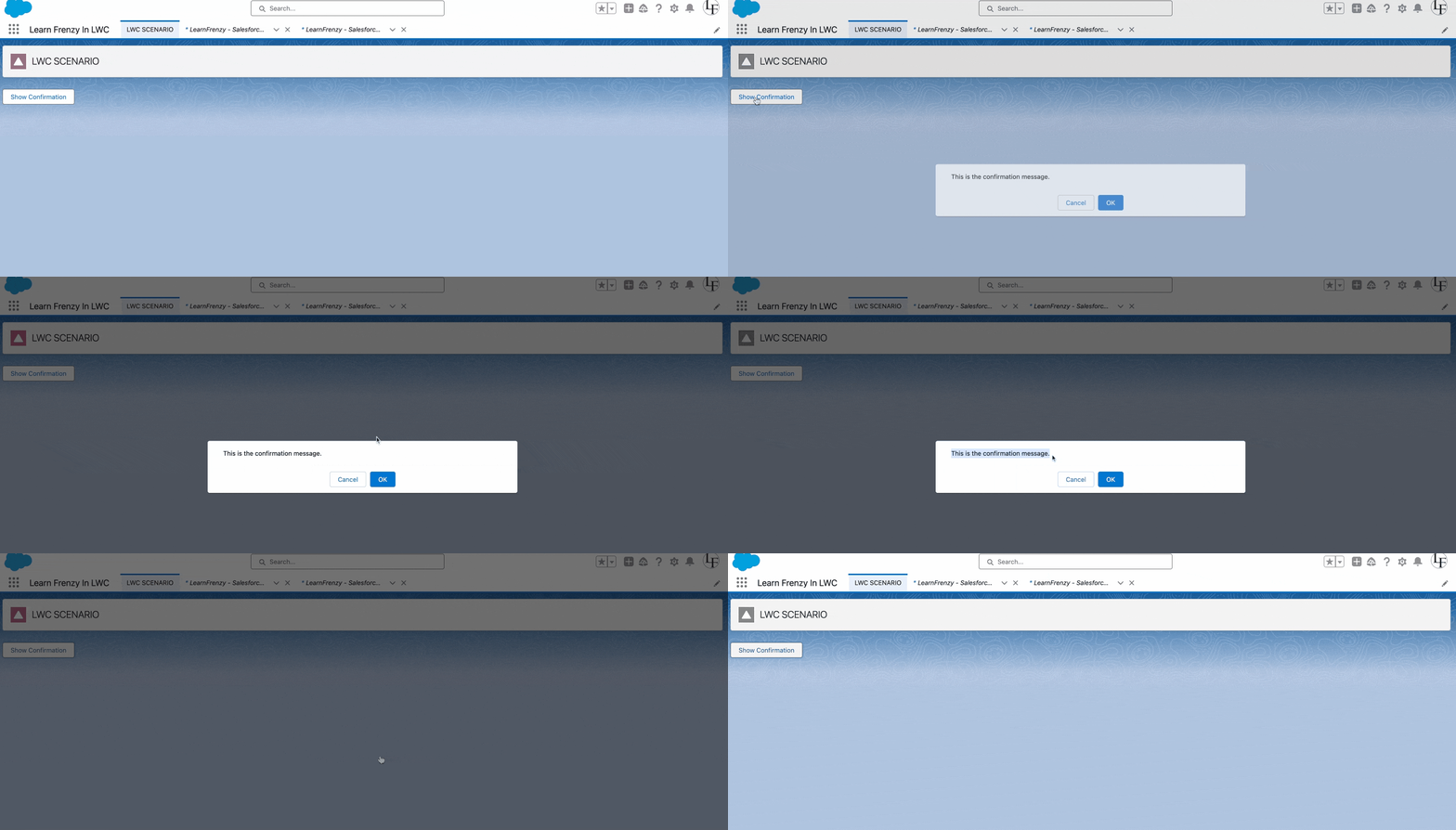
The Confirm Modal engages users in confirming critical actions to prevent mishaps. It prompts users for a decision, typically with "Yes" and "No" options.
- To display a confirm modal in Lightning Experience, import `LightningConfirm` from the `lightning/confirm` module, and call `LightningConfirm.open()` with your desired attributes.
- `LightningConfirm.open()` is always return Promise, to handle promise use
async/awaitor.then()for any code you want to execute after the modal is closed.
Example Code:
  <lightning-button label="Show Confirmation"
                    title="Show Confirmation"
                    onclick={handleConfirmClick}>
  </lightning-button>
// confirmModalExample.js
import { LightningElement } from 'lwc';
import LightningConfirm from "lightning/confirm";

export default class ConfirmModalExample extends LightningElement {
  async handleConfirmClick() {
    const result = await LightningConfirm.open({
      message: "This is the confirmation message.",
      variant: "headerless",
      label: "This is the aria-label value",
    });
  }
}
This modal is used to prompt users for confirmation before proceeding with a particular action. Let me explain the code:
- The component imports `LightningElement` from the LWC module, which is the base class for Lightning Web Components.
- It also imports the `LightningConfirm` component from the "lightning/confirm" module, which is a built-in module provided by Salesforce for creating confirmation modals.
- Inside the `ConfirmModalExample` class, there's a method named `handleConfirmClick`. This method is invoked when some action triggers the confirmation modal to open. For example, it could be triggered by clicking a button or some other user interaction.
- Within the `handleConfirmClick` method, the `LightningConfirm.open` function is called. This function opens the confirmation modal. It takes an object as an argument with the following properties:
- `message`: This property defines the message or content to be displayed in the confirmation modal. In this code, it's set to "This is the confirmation message."
- `variant`: This property defines the appearance or style of the confirmation modal. In this code, it's set to "headerless," which indicates that the modal doesn't have a header.
- `label`: This property is used to set an aria-label value for accessibility. It provides an accessible name for the modal.
- The `await` keyword is used to wait for the modal to be closed, and the result of the confirmation (whether the user confirmed or canceled) is stored in the `result` variable.
This code essentially opens a confirmation modal with a message and style specified in the `LightningConfirm.open` function. Users can confirm or cancel the action, and the result is captured in the `result` variable.
The modal provides a way to seek user confirmation before proceeding with a critical action, ensuring that users are aware of and intend to perform the action.
Output:
3. Prompt Modal
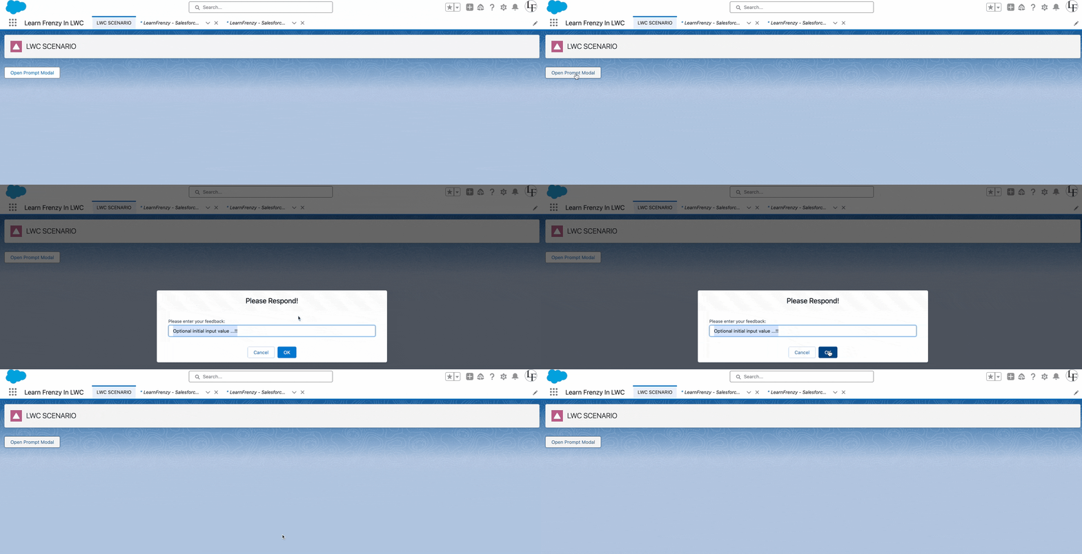
A prompt modal is a user interface component that allows you to collect user input or feedback within a modal dialog. It typically provides an input field and buttons for the user to confirm or cancel their input.
- To display a prompt modal in Lightning Experience, import `LightningPrompt` from the `lightning/prompt` module, and call `LightningPrompt.open()` with your desired attributes.
- `LightningPrompt.open()` is always return Promise, to handle promise use
async/awaitor.then()for any code you want to execute after the modal is closed.
In this example, we'll create a prompt modal in a Lightning Web Component (LWC) using the built-in `lightning/prompt` module.
Here's an example code and explanation of how to create a prompt modal in LWC:
Example Code:
  <lightning-button label="Open Prompt Modal"
                    title="Prompt Modal"
                    onclick={handlePromptClick}>
  </lightning-button>
// promptModalExample.js
import { LightningElement } from 'lwc';
import LightningPrompt from "lightning/prompt";

export default class PromptModalExample extends LightningElement {

  handlePromptClick() {
    LightningPrompt.open({
      message: "Please enter your feedback:",
      // theme defaults to "default"
      label: "Please Respond!", // this is the header text
      defaultValue: "Optional initial input value ...!!",
    }).then((result) => {
      // prompt modal has been closed
    });
  }
}
Here's an explanation of the code:
1. Import Statements:
import { LightningElement } from 'lwc';
import LightningPrompt from "lightning/prompt";
In this section, the necessary imports are performed. The component imports the `LightningElement` from the 'lwc' module and `LightningPrompt` from the 'lightning/prompt' module.
2. Component Definition:
export default class PromptModalExample extends LightningElement {
This code defines the Lightning Web Component named `PromptModalExample`.
3. handlePromptClick Method:
handlePromptClick() {
  LightningPrompt.open({
    message: "Please enter your feedback:",
    // theme defaults to "default"
    label: "Please Respond!", // this is the header text
    defaultValue: "Optional initial input value ...!!",
  }).then((result) => {
    // prompt modal has been closed
  });
}
- The `handlePromptClick` method is invoked when an action (e.g., button click) triggers it. It uses the `LightningPrompt.open` method to create a prompt modal.
- Within the `LightningPrompt.open` method, you specify the properties of the prompt modal:
- `message`: This sets the message or prompt that instructs the user (e.g., "Please enter your feedback").
- `label`: This sets the header text of the prompt modal (e.g., "Please Respond!").
- `defaultValue`: This provides an optional initial input value that the user can modify.
- The `then` function is used to handle the result after the user interacts with the prompt modal. It indicates that the prompt modal has been closed, and you can include additional logic to process the user's input or take further actions.
This code creates a simple prompt modal that prompts the user for feedback. When the modal is closed, you can add logic to process the user's response.
Output:
4. Toast Notification
Toast notifications in Lightning Web Components (LWC) are like small pop-up messages that provide feedback, confirmation, or information to users. They are handy for letting users know about the status of actions or providing important updates.
- To trigger a toast from a Lightning web component, in the component’s JavaScript class, import `ShowToastEvent` from `lightning/platformShowToastEvent`.
Create a ShowToastEvent with a few parameters, and dispatch it.
Paremeters :
- `title`: The title of the toast, displayed as a heading.
- `message`: A string representing the body of the message. It can contain placeholders in the form of {0} … {N} with curly braces. The placeholders are replaced with the links on messageData.
- `variant`: success, error, info, warning
- `messageData`: It accept String[] or an Object, used for “url” and “label” values that replace the {index} placeholders in the message string.
- `mode `: dismissible(default), pester, sticky.
![]() MIND IT !
MIND IT !
`ShowToastEvent` isn’t supported on login pages in Aura sites. `ShowToastEvent` is also unsupported in LWR sites in Experience Cloud. Instead, use the `lightning/toastContainer` module (Beta).
Here's a straightforward example of how to use a toast notification in LWC:
Example Code:
Let's break down the code:
- We use the `<lightning-card>` component to create a card with the title "Toast Notification Example."
- Inside the card, we have a `<div>` element with a button. The button has a label "Show Toast" and is styled with the Salesforce Lightning Design System (SLDS) classes to give it a brand color.
- The `onclick` attribute is set to call the `showToast` JavaScript function when the button is clicked.
This code represents a simple LWC that displays a button. When the button is clicked, it triggers a toast notification.
// toastNotificationExample.js
import { LightningElement } from 'lwc';
import { ShowToastEvent } from 'lightning/platformShowToastEvent';

export default class ToastNotificationExample extends LightningElement {
  showToast() {
    // Create a new toast event
    const event = new ShowToastEvent({
      title: 'Success!', // Title of the notification
      message: 'This is a success message.', // Content of the notification
      variant: 'success', // Type of notification (success, error, warning, info)
    });

    // Dispatch the event to display the toast notification
    this.dispatchEvent(event);
  }
}
Let's break down the code:
- We import `ShowToastEvent` from `'lightning/platformShowToastEvent'` to use it to create the toast notification.
- The `showToast` method creates a new toast event.
- You can customize the title, message, and variant of the toast notification.
- Finally, we use `this.dispatchEvent(event)` to show the toast notification to the user.
When you call the `showToast` method in your LWC component, it will display a success toast notification with your specified title and message. You can change the `variant` to 'error', 'warning', or 'info' to display different types of toast notifications.
Output:
It's a user-friendly way to provide feedback or alert users in your LWC applications.
Conclusion
In this blog, we explored various notification types in LWC: Alert Modal, Confirm Modal, Prompt Modal, and Toast Notification. Each notification type serves a specific purpose, helping you create user-friendly and informative interfaces. Implementing these notifications effectively in your LWC components can significantly enhance the user experience and streamline user interactions.
Now that you've learned how to display notifications in LWC, you can start incorporating them into your Salesforce applications to keep your users informed and engaged.
Happy coding with LWC!


.png)
Comments (0)
What others are saying about this article
No Comments Yet
Be the first to share your thoughts on this article.
Leave a Comment
Share your thoughts and join the discussion